
The Power of Data Visualization: Using Data to Make Insights Come to Life
Multiple studies have concluded that the human brain is wired to absorb visual content 60,000 times faster than text-based data.
Human beings process data visually and emotionally. The ability to create a relatable narrative around the story data tells, allows us to connect with it on a human level and link it back to scenarios and realities that are familiar to us. Storytelling comes in to make sense of the figures in a way that reflects our lives and environment. Visualizing that data into context is what we’ve done since the dawn of time to understand the world around us. With data becoming more complex, the need to simplify and contextualize it, has only gotten greater.
What is data visualization? It’s a way for people to process complex information in a way that is familiar to them, through storytelling. While technology, information sources and data might change, we won’t. That’s why data visualization plays a significant role in presenting analyses, findings or concepts in ways that is understandable and relatable.
Data visualization stands at the crossroads between data and design, which opens the opportunity for more contextualization of the often complicated and seemingly detached word of data. Combined with a narrative, data visualization offers a way for the audience to follow a data story more easily and attach their own ideas and thoughts to it.
What does data visualization really mean and do?
1. It simplifies information complexity
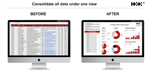
At H+K, we hold a passion for data and creativity. We like to equip our clients with the power to visually understand performance data that resulted from their campaign. This opens opportunities for them to explore, digest and comprehend something initially so raw and complex.

In this increasingly data saturated and reporting hungry world, our role is to help simplify and make sense of the story the data really tells. By analyzing it in context and shaping stories around it, both verbally and visually, it will answer the questions and challenges we set out to understand for our clients.
When turning complex data sets into visualizations, we undoubtedly increase our chances to solve the initial complexity issue we face with data. It allows the audience to better navigate and perhaps focus on the information that’s deemed important. It reveals certain patterns and connections that would otherwise go unnoticed. Simplifying complexity does not mean making complicated things simpler. It means finding a way to speak to the brain so it comprehends almost instantly an information that would have been too complex if kept in its original form. By using visual cues like colors, shapes and patterns, the brain will be in a position to absorb this information faster.
2. It informs the right insights
Data visualization plays a crucial role in simplifying and defining strategies that are easy to grasp, implement and track. The insights we derive from various tools, platforms and research can be used for multiple purposes. It helps dictate content and publishing strategies for clients. It also helps us answer simple yet critical questions about the audience we want to speak to, how to reach them and where to find them. Insights are keys to clarity, but they are also synonym of actions, findings and changes. In other words, optimization.
We empower our clients with the aptitude to drive their own insights from the visualizations we build. By building visuals they can easily understand from an initially complex set of data, we draw them into our analysis and consequently help them connect the dots. The reason we simplify data and analyze it in context is to provide clients with the ability to quickly and tangibly understand the impact of their work, what performed well and what didn’t, where we utilize our analysis to optimize and constantly improve. When we look at performance data from a campaign and drive the relevant insights, it helps us polish and optimize our next campaigns.
3. It tells a story that words cannot
Data tells stories and we are the storytellers. Data on its own is just a lot of numbers and disconnected facts, but if data is analyzed a certain way, connections appear, and an incredible story can be told. With the right narrative and message, stories extracted from data and visualized in a comprehensive way can be extremely powerful. Brands that succeed in this space are using their own available data to create impactful marketing stories that not only solidify their position in often saturated industries but draws their consumers into their world.
As data visualization expert David McCandless mentioned in his decade old TED talk “if you combine the language of the eye with the language of the mind (words, numbers and concept), you start speaking two languages simultaneously, each enhancing the other”. Through a combination of what we have unconsciously absorbed with what we consciously learn, data visualization opens up a wide range of opportunities for storytelling.
A version of this article was first published in PRWeek Asia
